Customer forms
This is part of the Stockashop Manual. It shows you how to manage and customise the various customer-facing forms that appear in a Stockashop. These forms are found on the contact, enquiry, registration, my account and checkout pages. Most of the fields are shared between all these forms, but you can insert extra questions. All these forms are still pages and you can change the text and images at the top as with any other page (see the content management manual).
Contact form
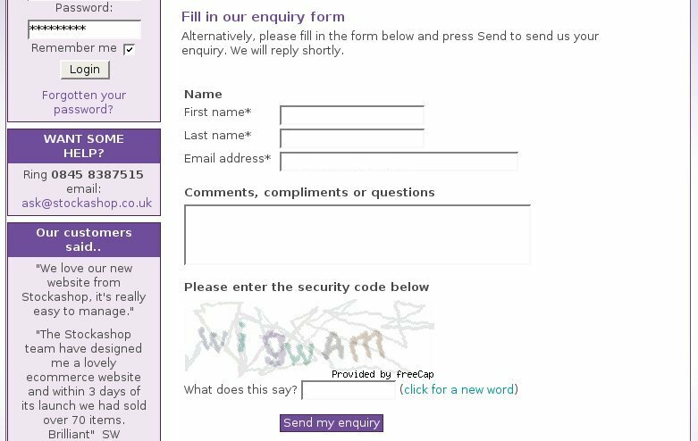 Every Stockashop can have a contact or an enquiry form (this is something that is set by us). A contact form starts with a "Name" heading, under which it asks for a customer's first name, last name, email address (all required) and "comments or special requests". It can also have up to 3 extra form fields after the email address (more on that below). And there's also a section below on changing the labels for the form fields.
Your site could also have the CAPTCHA feature. CAPTCHAs are the funny images with obscure letters or words that try to make sure it is a human filling in the form and not a piece of software. They prevent SPAM but put another barrier in the way of customers trying to contact you. There is more on SPAM below.
When the contact form is submitted, the customer and shop administrator are sent a confirmation email, and the customer is taken to your site's contact thanks page. See the page types manual for more about this.
Enquiry form
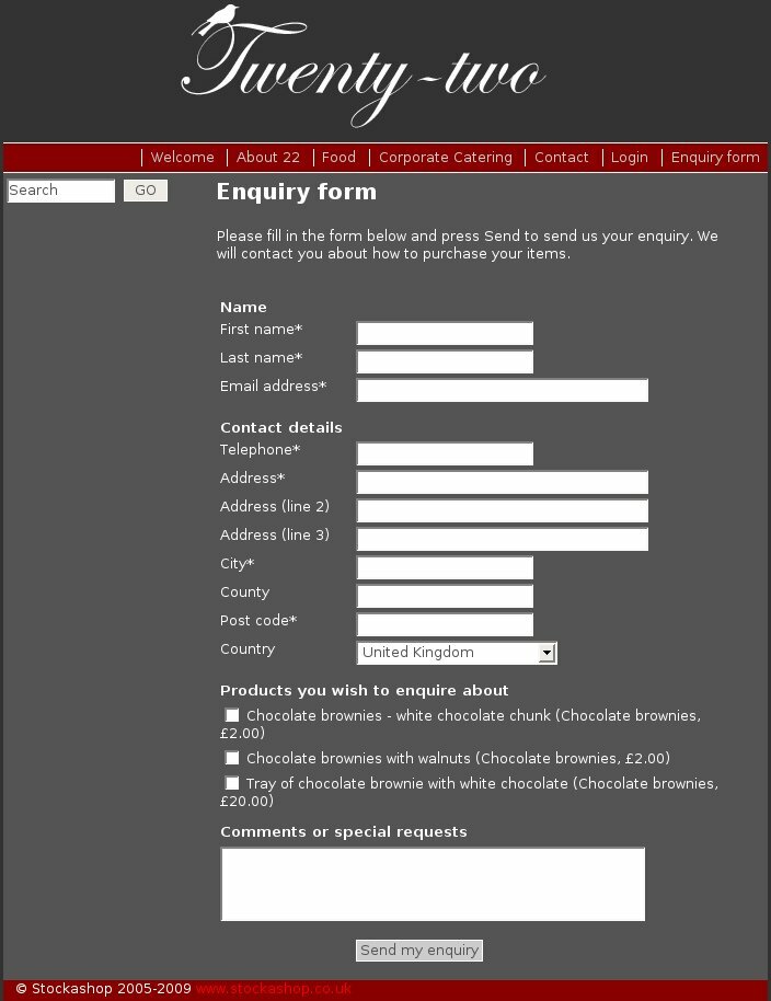 An enquiry form is an extended contact form. After the email address and optional extra fields (see below), it additionally has a "Contact details" heading with the customer's telephone number? (required), first line of address (required), second line of address, third line of address, city (required), county, post code (required) and country.
Then the form has a section for "Products you with to enquiry about", with a list of all the non-hidden products on your site (with their category and price) and a checkbox next to each. Followed by the comments box and optional CAPTCHA.
This is a quick way for customers to tell you which products they are interested in, and is especially useful for sites which aren't ready for full ecommerce yet, but would still like to let customers find out and enquire about products.
After submitting the enquiry form, the customer is taken to your enquiry thanks page.
Checkout form
 The checkout form comes after the Shopping Basket on ecommerce sites.
There is an extra Stockashop feature which affects this form, called the "shipping (or delivery) address feature". It can be set to "no", "yes" or "yes with fax, contact, company and telephone".
Under the "Name" heading, the form first asks for the customer's first name (required) a last name (required). If your site has the full shipping address feature, it asks for company name. If your site has the birthday feature (where you can send a personalised email to customers on their birthdays), it aks for their birth date. Then it includes the exra checkout fields (see below). Finally, if you site has the vouchers feature, the form will ask for a voucher code (see the vouchers manual for more about this).
Under the heading "contact details", it then asks for the customer's telephone (required), fax (for full delivery addresses) and email. If your site has the customer email feature, there is an opt-in checkbox which says "If you would like to receive information about our latest products please tick the box."
Stockashop has been integrated with Post Code Anywhere, a service which allows your customers to just type in their post code, press a button, and then automatically fill the rest of the form with the rest of their address. To use this feature, a custom "postcodeanywhere.js" file must be placed in the "common" directory.
If your site has the shipping address feature, the form then has the shipping heading. If you've got the full feature, it asks for the customer's shipping contact name, company and telephone. Then it asks for the customer's shipping address (3 lines of address, city, county, post code, country) and optional shipping notes (see "adding optional fields" below).
Then it asks for comments and an optional order date (see "adding optional fields" below). This field can be useful if the customer needs to receive a delivery on a certain date. Finally there is another optional "terms and conditions" checkbox. If you use this, then the customer must tick the box next to the statement before making their order. This is useful if you need them to agree with your terms and conditions.
After submitting, the customer is taken to the confirmation page.
Note that if you are a shop administrator, making a test purchase on your own site, the checkout form will not allow you to change your email address, and it will put a warning at the top to the same effect. This is because sometimes shop administrators make purchases on behalf of their customers, but they should always logout first before doing this.
My Account form
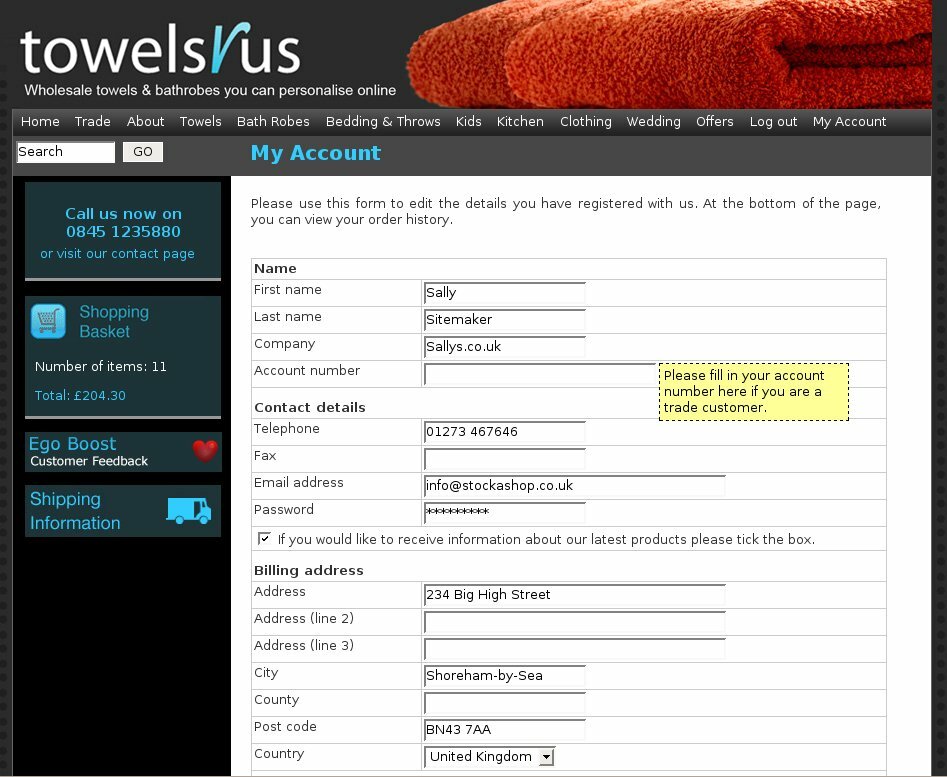 If your Stockashop allows customers to log in, then after logging in, they will usually arrive at the my account page. This can be changed, either by putting a redirect into the login page itself, or setting the login page on a customer by customer basis.
In any case, the my account form is very similar to the check out form. It asks for the first name, last name, company (for sites with full shipping address feature), birth date (if birthday feature) and extra my account/registration questions. For sites with the credit feature, it then shows the customer their current credit and their credit limit. And for sites with repeating orders, it lets them enter a number of weeks to skip their orders.
The contact details section asks for telephone, fax (if full shipping address feature), email, password and opt-in email question.
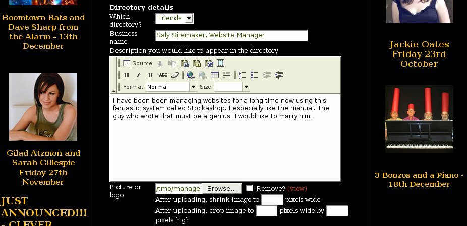 Stockashops with the directory feature then have a "Directory details" section (shown on the right). This includes the directory page where the customer should be shown, their (business) name for the directory, description and image (cropped to 400 pixels wide). This feature allows you to have a self-managed directory of suppliers, artists or customers.
The form then asks for the billing and shipping address as with the checkout form.
Next is an area for a very rarely used Stockashop feature which allows customers to change the header image and colours of your their view of your site! Whenever they log in, your site will change to use their colours. I can't remember why we put this feature in in the first place, and no sites use it at present.
After submitting the form, the customer is taken back to the top of the My Account page.
Underneath the form, the My Account page then shows the customer's credit history (for sites with the credit feature), order history and repeating items (for sites with repeating orders).
Registration form
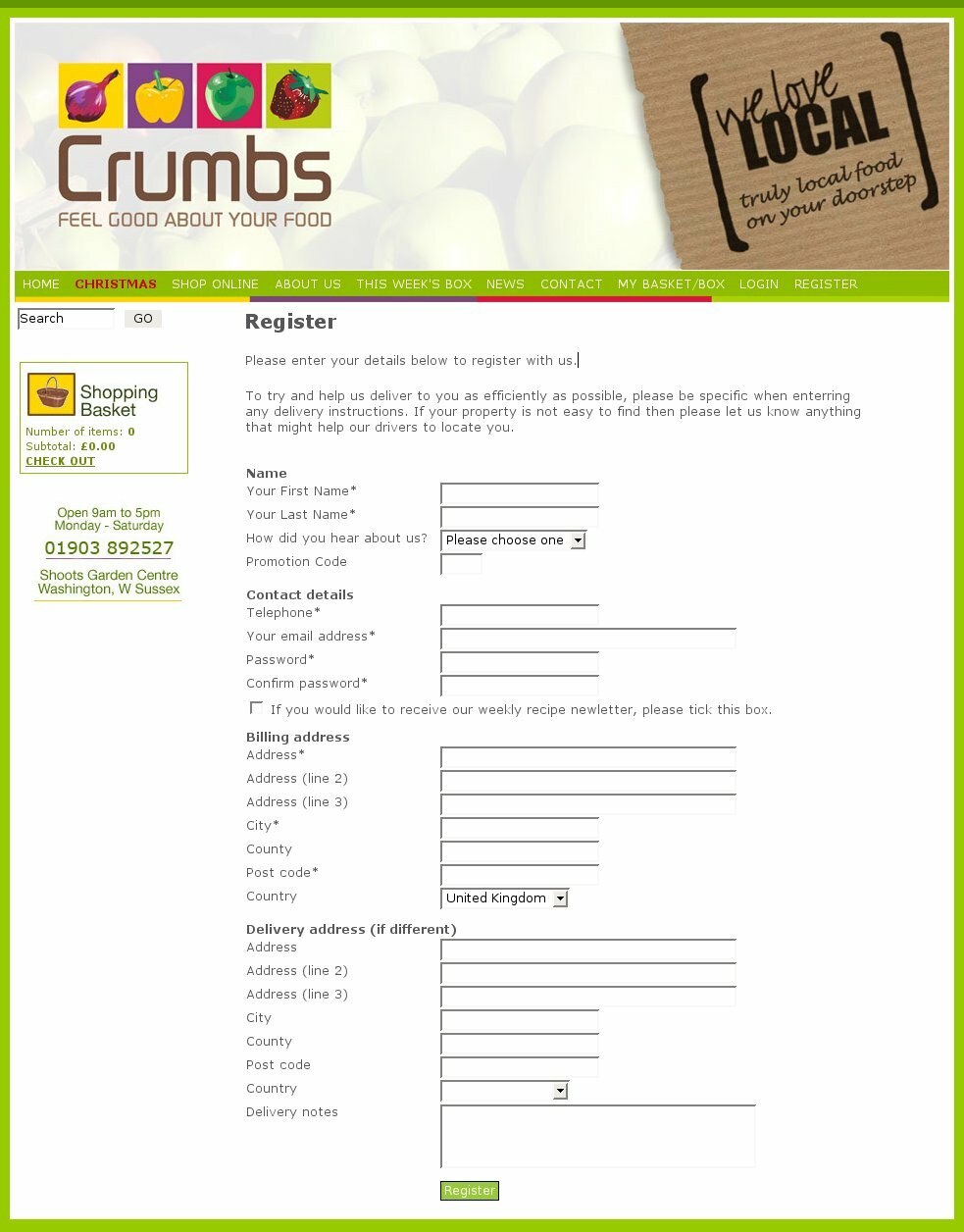 The registration form is available to Stockashop sites which have the "customer login with registration form" feature. It is very similar to the My Account form, except it doesn't show the credit or order history. It also has an additional "Confirm password" field, which the customer must fill in.
After submitting for the form, the customer and shop administrator are sent an email, and the customer is sent to the register thanks page.
Changing field labels
It is very easy to change the labels on form fields. For example, you may want to ask for "Surname" instead of? "Last name". Or more commonly, you may wish to ask for your customer's "Comments and questions" instead of "Comments and special requests".
Note that almost most of the fields are shared between all the forms, so the label will change on all the forms. It will also change in any emails (like enquiry and order confirmations) which are sent by the site.
To do this, you will need to go to the main management area and click on "Text and translations". Here you will see a long table with the "Lookup/reference" on the left and "English text" on the right.
Scroll down the list, until you get to the references starting with "form-". For example, go down to "form-last-name". On the right it shows a snippet of what your site currently has for this bit of text (probably "Last name"). If you click on "form-last-name" you will get to a page which allows you to change this from its default Stockashop setting.
You can also change the headings of the form sections such as "form-name-header", currently set as "Name" or "form-contact-details".
To revert a setting back to its default, Stockashop setting, simply remove the text string.
Making fields required
Some of the form fields above (such as the first name, last name and email) are already required and appear with an * after them in the forms. If you want to make any other form fields required, such as the fax number or county, simply add an * to the end of the text string.
You can even change the * into something else by changing the form-required text string. (When displayed, the * appears inside a and the
Adding optional fields
To enable the shipping notes, order date and terms and conditions fields in the Checkout form, you need to fill in the corresponding text strings: form-shipping-notes, form-terms, form-terms-required and forms-order-date.
For the shipping notes, something like "Shipping notes" or "Delivery notes" would be good. For the terms, something like "Please check the box to agree to our terms and conditions" (with a bit of HTML you could link to your terms and conditions page in a new window). The form-terms-required string determines if the customer has to agree to your terms and conditions satement. The text entered here will be shown to the customer in an Javascript popup alert if they fail to check the box. And for the order date, enter "Preferred delivery date" or whatever you would like to use the field for.
Adding extra fields to forms
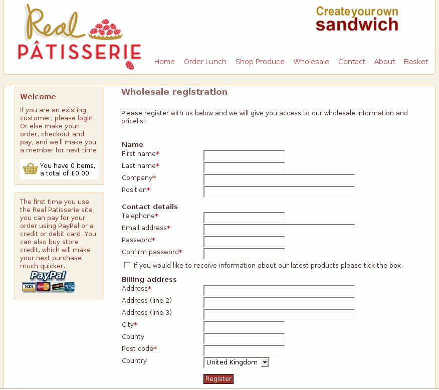 In the text and translations list, you will also notice lots of references starting "form-extra". These are for the extra fields in the forms above, which appear in the first section of each of the forms.
The examle on the right is a registration form with two extra fields for "company" and "position", both required.
There are three groupings of extra fields - for the contact or enquiry page (with references starting "form-extra-enquiry"), for the checkout page ("form-extra-checkout") and for the my account and registration page ("form-extra-register").
For each grouping, there are 3 sets of fields (eg form-extra-enquiry1). And for each set of fields there is a label, label-help and options. Entering something for the label will cause the form field to show up in the given form(s), initially as a checkbox.
Entering something for the help box (eg form-extra-enquiry1-label-help) will cause a yellow help box to popup when the customer clicks on the checkbox (or other form element). This way you can tell the customer what the field is for.
The options determine what type of form field will be shown. A different type of field will be shown depending on what you enter. Assuming the field name is "Job title", here's what you can do:
The extra fields and their labels will be carried through to the contact/enquiry and order confirmation emails as well.
Forms and SPAM
These days, there is lots of automated software, crawling the Internet, looking for "contact us" forms which they can fill in automatically and submit. Their aim is to inject a message about imitation watches (or whatever they're trying to sell). This is called email injection.
At first, these forms were hijacked so that the SPAMmer could use your "Contact us" form to send the email to everyone on their list, by adding email headers to the message body. Now it is also common for SPAMmers to just try to send the site administrator the message.
Stockashop has an anti-SPAM script in place to stop both of these kinds of attacks. The first is easier to detect (by refusing any form with Cc and other headers in it). The latter is more difficult as sometimes the only bits of the message that get through are nonsense or a part of a link to a website, and its difficult to automatically tell the difference between a valid customer enquiry and a nearly valid nonsense message.
So the anti-SPAM script tries its best: by checking the sender's IP address against known lists of SPAMmers, checking any links the email contains, checking for blocks of random characters and things like that. If the message fails any of these tests, they get an error message back saying "Unauthorised access" with a reason why they were denied.
Despite this, some SPAM still gets through as they are constantly updating their software to get around the defences. So if you do get a lot of a particular SPAM message through your contact us form, please forward it to us, and we'll see if we can use it to improve our anti-SPAM script.
As mentioned above, you can also ask us to add a CAPTCHA to your site, which is even better at stopping automated software. However, it puts another step in front of your customers, a sometimes frustrating step, and (the Stockashop CAPTCHA) does not cater for audio browers or customers who have trouble seeing. So unless you get huge amounts of SPAM through your contact us form, it's probably better without the CAPTCHA.
Editing customers
In the management area, when you edit customers, you will be able to view and change all the fields included in all the forms above (except for the checkout form's order comments and order date as these belong to the order rather than the customer).
So you will also be able to view and edit the information they have entered into each of the three types of extra fields. These are shown under the headings "Extra enquiry/contact fields", "Extra checkout fields" and "Extra register/my account fields". So if you asked the same questions in all three types of form, you will see the same question repeated three times under the different headings.
HAPPY CLIENTS
"Collarways have used the
Stockashop eCommerce
system for 18 months and
have been delighted with
the results."
Gabriela Lerner, Collarways
See our portfolio...
LOGIN AREA
CONTACT US TODAY?


